Designing trust into a high-converting acquisition flow
Super.com, all in one savings app
I worked on the acquisition team at Super.com, a membership app that helps people save on everyday spending. Rebates was one of the ways we introduced new users to Super+ through cashback offers shown after checkout with one of our partners.
Overview
What is Rebates?
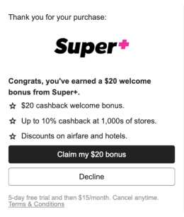
The users entered the Rebates flow right after making a purchase somewhere else, many had little context about Super.com. The original flow converted well, but some users did not fully understand that they were signing up for a recurring membership. This led to quick cancellations and disputed charges.
Our main goal was to reduce cancellations while still growing acquisition and conversion numbers. The challenge was making the membership clearer and more trustworthy without making the offer less appealing or adding too much friction.
The problem
A high-converting flow was setting the wrong expectations
About 70% of trial users became paid members, but 50% of those users would cancel and dispute charges in the first 3 months.
I ran two rapid validation sprints with UXR to understand where the confusion was coming from. The first focused on iterating on the landing page and signup experience. The second looked at the post-onboarding journey and the value we could bring to the user after they sign up.
Three problems kept coming up.

The approach
Showing the right information at the right time
After a number of iterations, the solution was not simply adding more information. I had to decide what people needed to understand before signing up, and what could wait until after.
- Who the offer was from
- That it was a membership
- What it cost
- That it renewed
- What did I unlock?
- What do I do next?
- How much progress have I made?
- How do I complete the reward?


The solution
A clearer signup and a guided reward journey
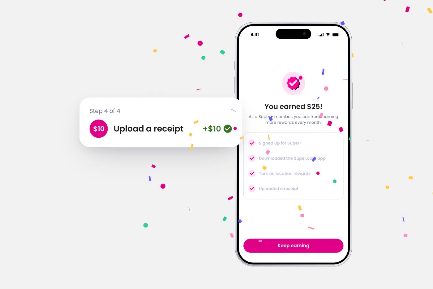
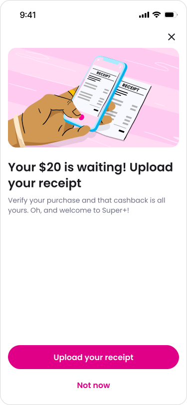
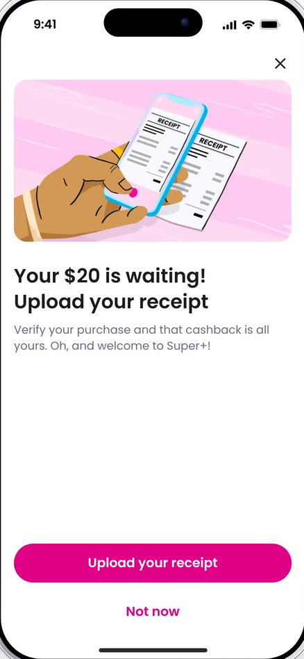
I made the membership and recurring price clearer before payment, then turned the reward into a four-step journey that showed members their progress and next action.
The changes improved trust. Disputed charges dropped from about 5% to under 1%, and the guided post-signup experience increased app opens from about 33% to 52%.
- Disputed charges
- ~5% → under 1%
- Post-signup app opens
- 33% → 52%
Landing page


Before

After
Post-onboarding
Before
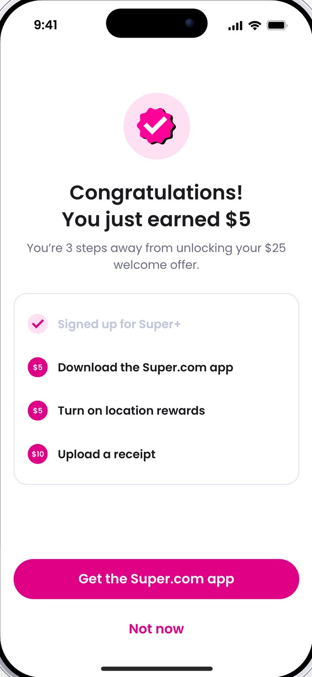
After
New problem
Clearer, and harder to convert
Making the membership clearer came at the cost of a decrease in conversion rates, and we were aware of that going into it. Trial-to-paid conversion dropped from about 70% to 35%.
Going back to the drawing board, we continued to iterate on how to balance the amount of transparency against the amount of information users want to see, and on how we could bring the conversion rate back up. I used what we had learned to keep the information that helped people make an informed decision, and to question the friction that did not.
As Rebates continued to grow, I also carried the strongest part of the new experience — progress and a clear next action — into the Rebates Hub, where members could see what they had completed, what was available, and what to do next.
New solution
Rebates 1.5, and the hub

Rebates 1.5
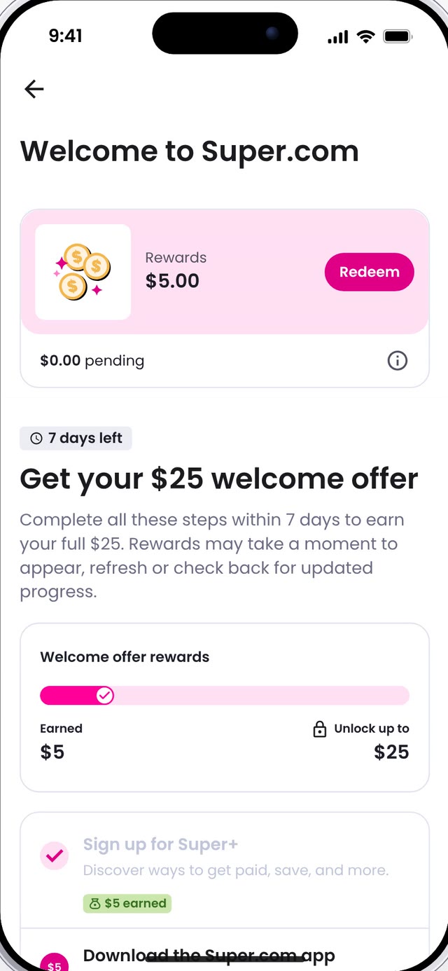
Rebates Hub
Learnings
What I learned
Clarity does not mean more information.
People need the right information at the right time, especially when they are deciding whether to sign up.
Good product decisions require looking at more than one metric.
Reducing disputed charges improved trust, but it also hurt conversion, so I had to think about both the user experience and the business impact.
Not every solution works everywhere.
Some patterns worked well after signup but did not translate back into acquisition. Testing helped us understand what to keep, what to change, and what not to pursue.