From one feature to a scalable protection suite
Super.com, all in one savings app
Super.com is a membership app that helps people save on everyday spending. Protection is one of the things that membership buys, and the product I worked on inside it.
Overview
What is Shipment protection?
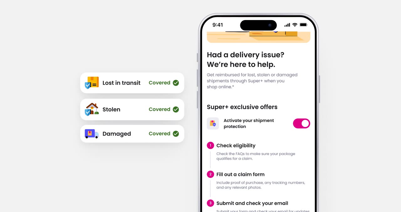
Online shopping has a familiar worry: what if the package never shows up, gets stolen, or arrives broken? Shipment Protection is a Super.com membership benefit that pays members back when that happens.
I designed it from the very first version. Over the next year it grew from one product sold through partner ads into a family of protection benefits, brought together in one place: the Protection Hub.
What's covered
Stolen
For packages taken after delivery.
Lost
For packages that never arrive.
Damaged
For items that arrive broken or damaged.
The challenge
How do you make a new benefit feel valuable?
Shipment Protection was a new product, so we did not yet know how people would understand it or what would make the benefit feel worth paying for.
I tested different ways of positioning it, from functional reimbursement language to a more emotional “worry-free protection” direction. The reassuring version performed best.
Through customer feedback and research, three problems kept coming up:
“When it says 100% reimbursement… it’s only $500… If I signed up and then read that later, I would probably cancel my membership.”
“I don’t wanna risk being a member and paying $15 a month and then not being able to use the service.”
- Trial signup
- 4.59% → 5.87%
- Relative lift vs. control
- +27.8%
People responded more to the feeling of being protected than to the mechanics of reimbursement.
That shaped how we positioned the product going forward: lead with the value, then explain how it works. The mechanics still had to be there — the usability testing was clear that finding them late felt like a bait and switch.
The approach
Three ways to say the same thing
The three versions below offer an identical benefit and differ only in what they lead with — a limited-time free trial, the package in front of you, or the feeling of not having to worry. Each pairs its headline with the same three-row proof block, so the comparison is the promise and nothing else.
Positioning
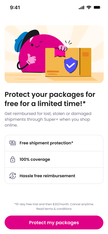
Limited time
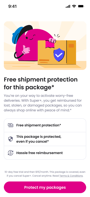
This package
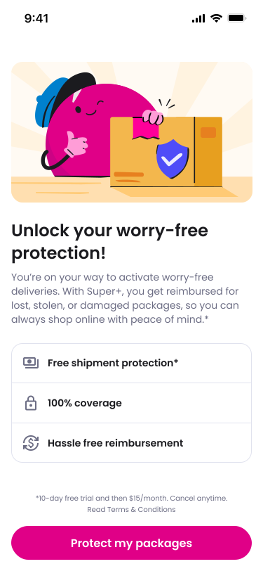
Worry-free — winner
A second test asked whether to sell the benefit on its own or as part of the wider membership. We compared a page about Shipment Protection alone against pages that bundled it with everything else Super+ includes. The focused page won, so the message stayed simple and specific.
Users like to know that Shipment Protection was there when they need it.
The solution
Turning policy into a guided claims experience
Getting members to sign up was only the first part of the experience. The product also had to work when something actually went wrong.
The original claims process relied on a third-party form that was difficult for both members and our operations team to work through. I designed the full in-app claims experience, translating policy rules into a flow that adapted to the member's situation.
- New members as it launched (Oct 2025)
- 21K
- M1 retention
- ~70%
From the page to the claim
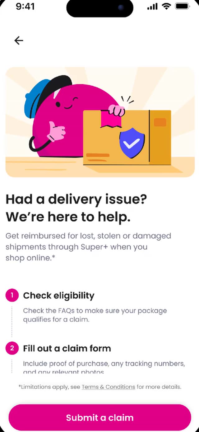
Info page
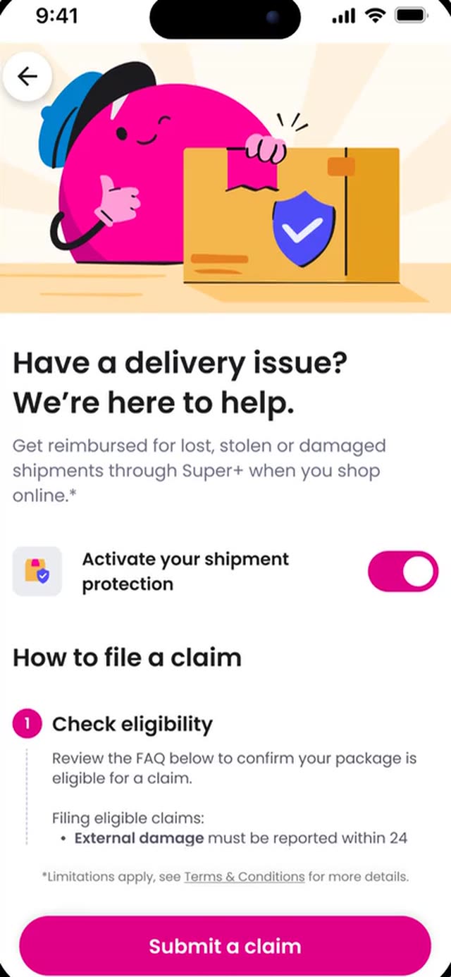
Claim flow
Wider reach
First offered only to shoppers coming from partner ads, it was later opened to all members.
A better claims experience
When a package goes missing, members file a claim in a guided in-app flow. It replaced a clunky third-party form and cut the claims the support team had to review by about half.
A second product
The success of Shipment Protection made room for more protection benefits.
The evolution
From one product to a protection suite
I designed Price Drop Protection, which pays members back if an item's price drops after they buy it. Together with Shipment Protection it became part of a bigger Purchase Protection plan — and that is where the problem changed.
Each product had its own home-screen tile, entry point and rules, and members on different plans had different benefits. Every new product would make the app more cluttered and harder to understand.
Member journey

One product, one path
Every route — the partner ad, the home-screen tile, the signup — converged on a single info page and a single claim form. Adding a second benefit meant adding a second one of everything.
One tile, one hub
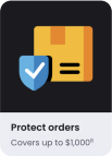
The entry point
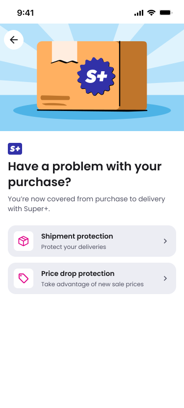
The full plan
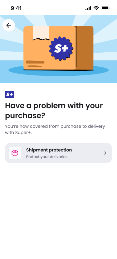
Shipment Protection only
The goal was not a jump in signups. It was to simplify without breaking anything.
So we ran a “do no harm” test with roughly 235,000 members per group between February and March 2026. The hub held, and rolled out to 100% of US members — the foundation the protection products that came after it are built on.
Learnings
What I learned
Launch, then let testing shape the product
Getting the first version into market gave us real signals about how people understood and valued protection — signals no amount of arguing about the copy beforehand would have produced.
People buy the feeling of protection, not the feature
Members may rarely need to use the product, so the two moments that matter most are understanding the value upfront and getting help when something goes wrong.
Designing for scale is an ongoing process
As new protection products continue to launch, I am still iterating on how they should fit into one clear system without adding complexity to it.